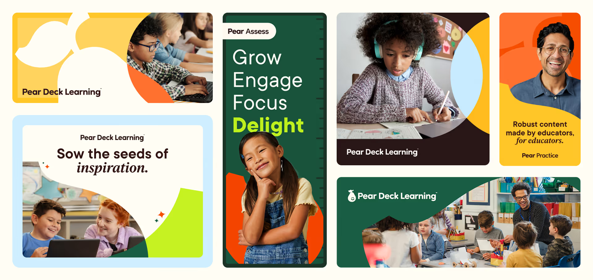
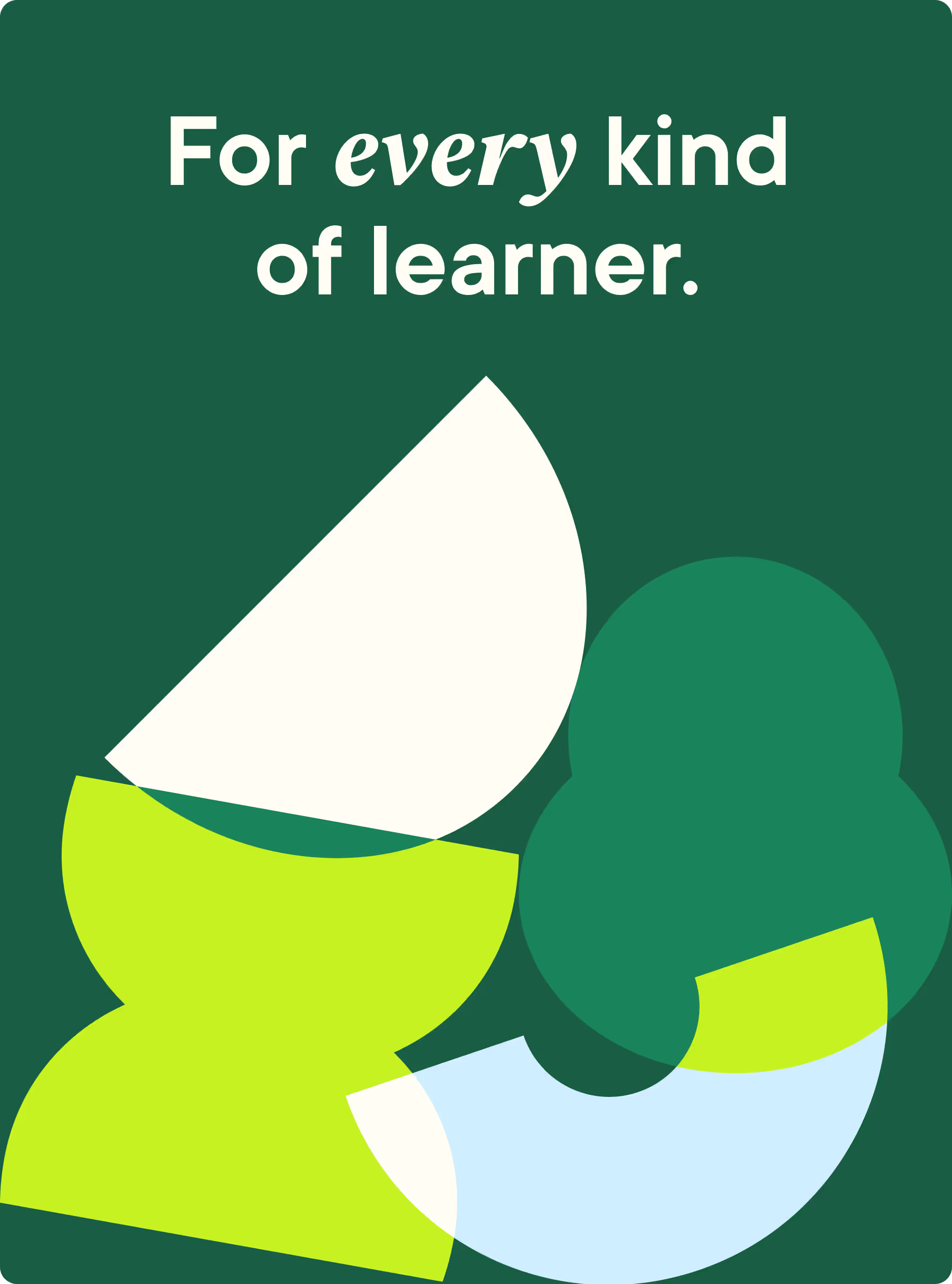
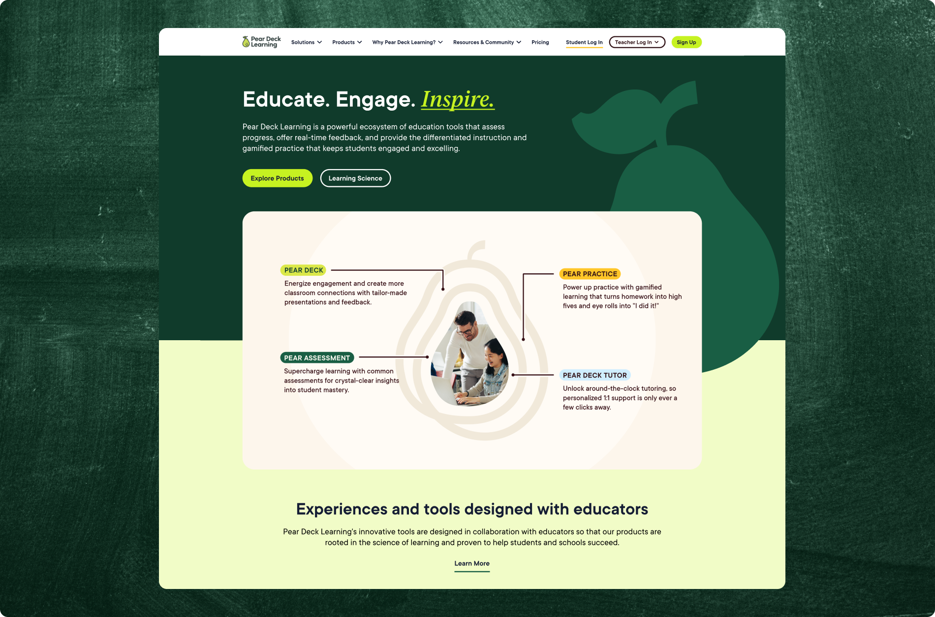
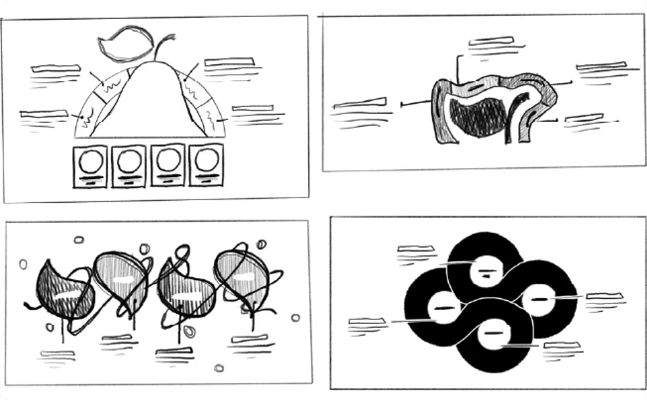
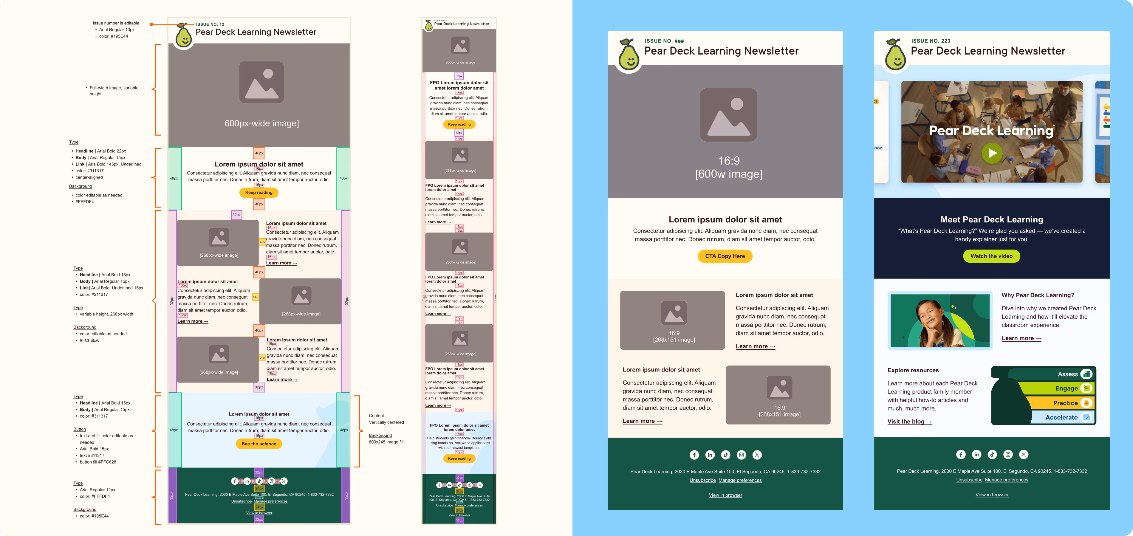
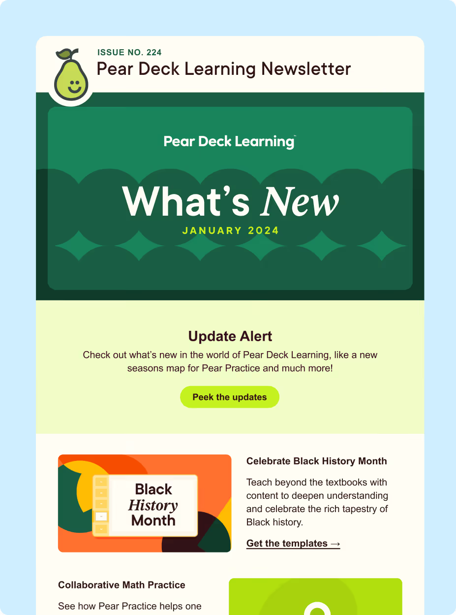
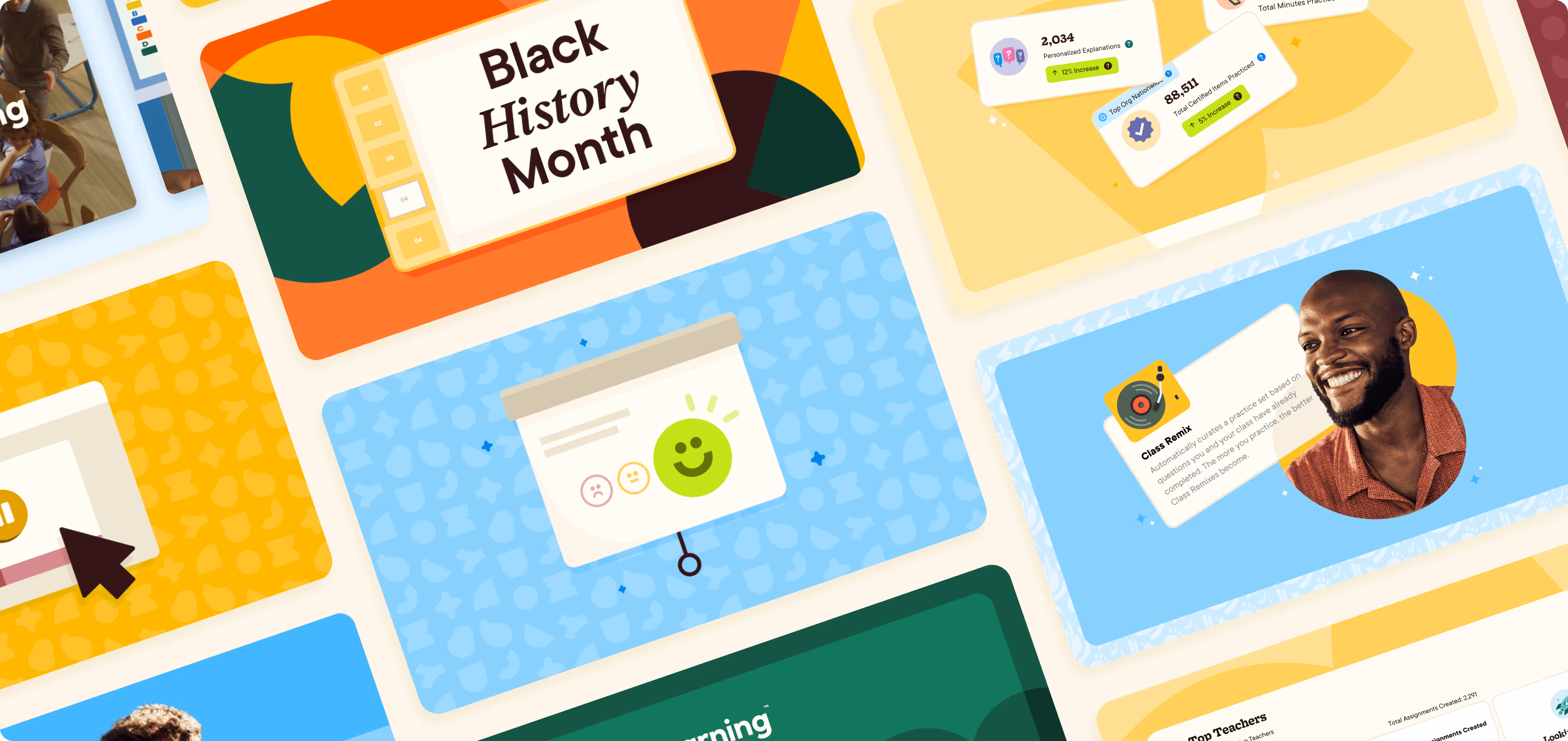
Our visual identity caters to diverse tones, audiences, and offerings, maintaining a delightful and distinct voice throughout. Geometric cutouts and shapes pull directly from Peary’s new look — the leaf symbolizing growth, the smile evoking the joys of learning — serving as illustrative elements, container shapes for imagery, and structural components across web and email layouts.