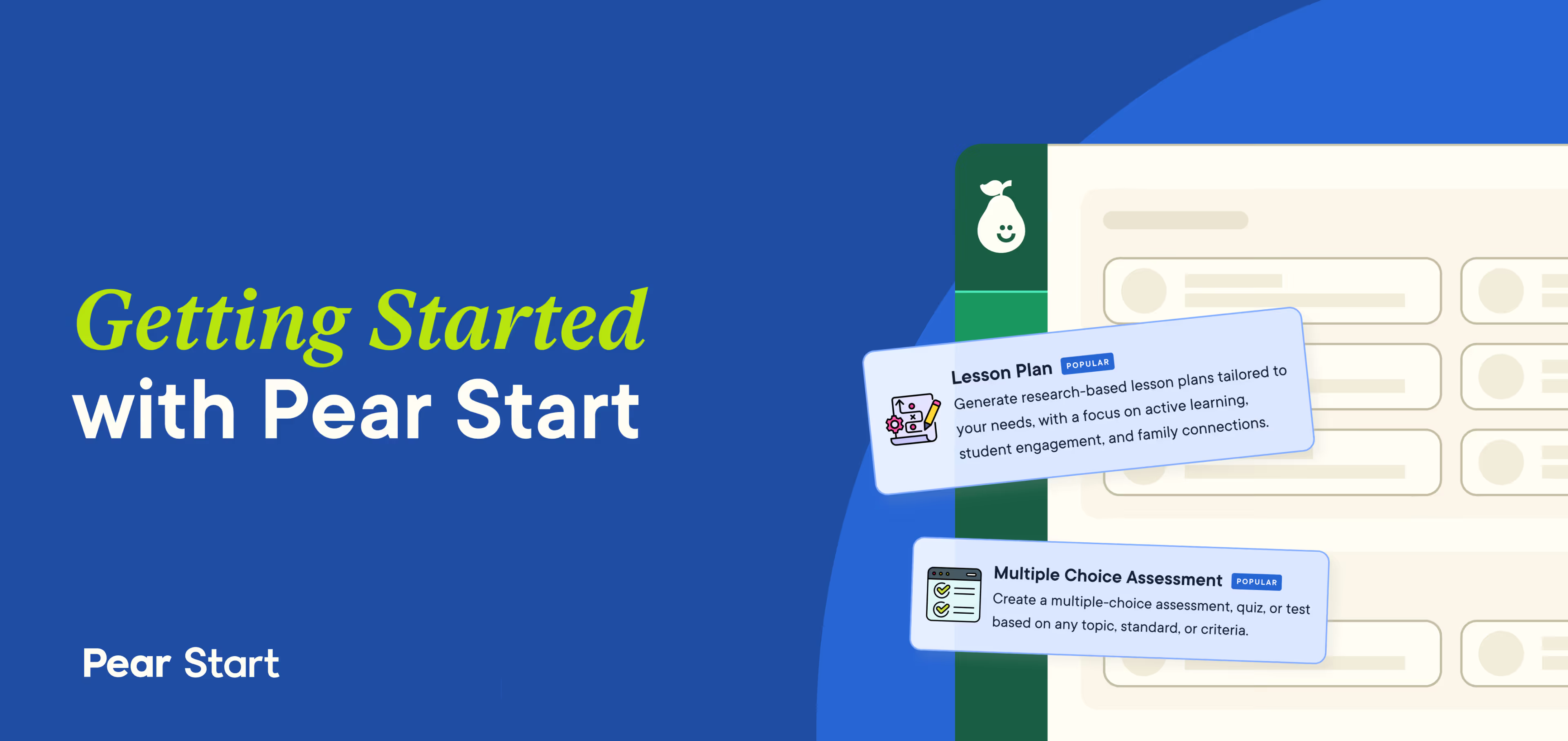
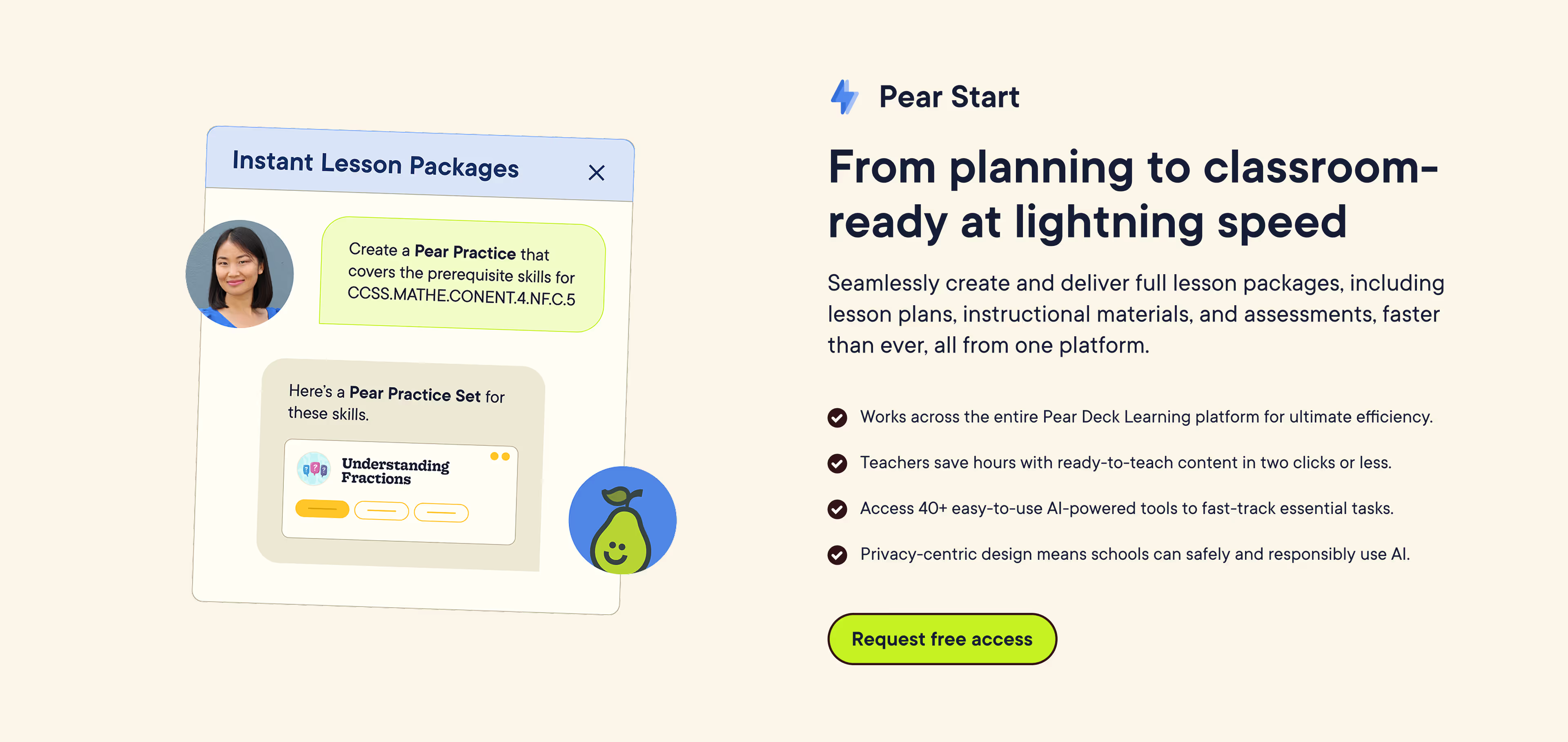
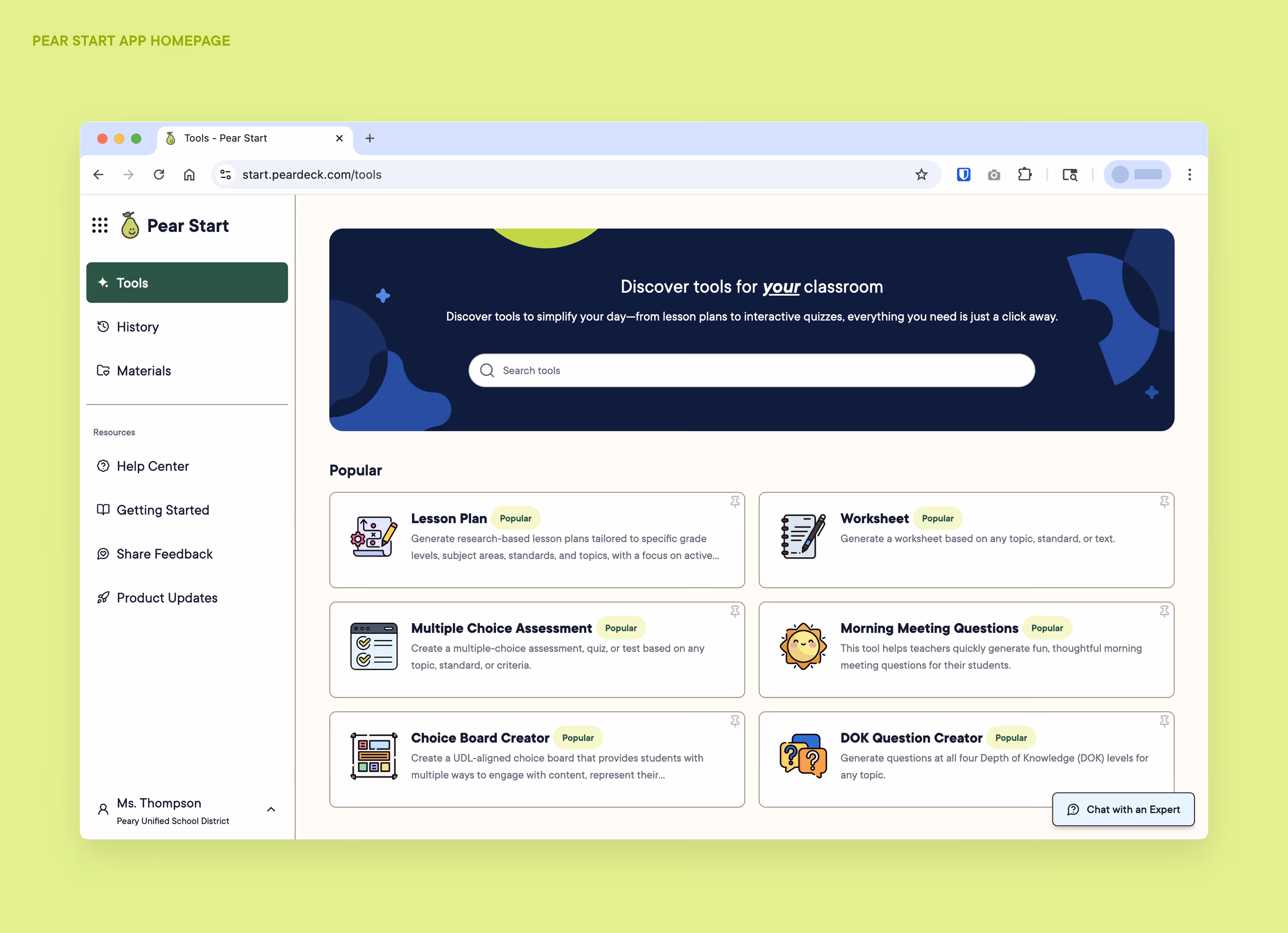
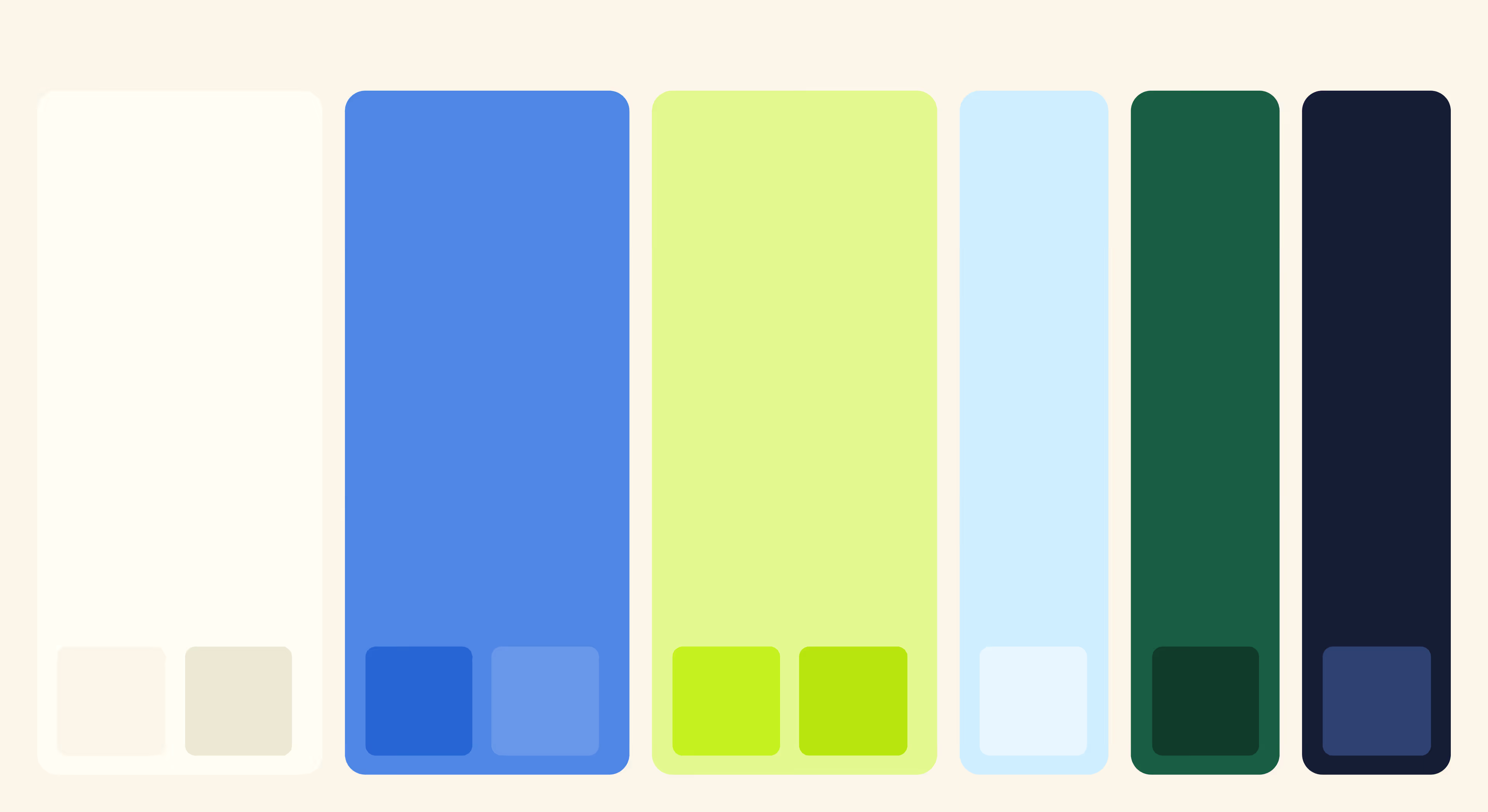
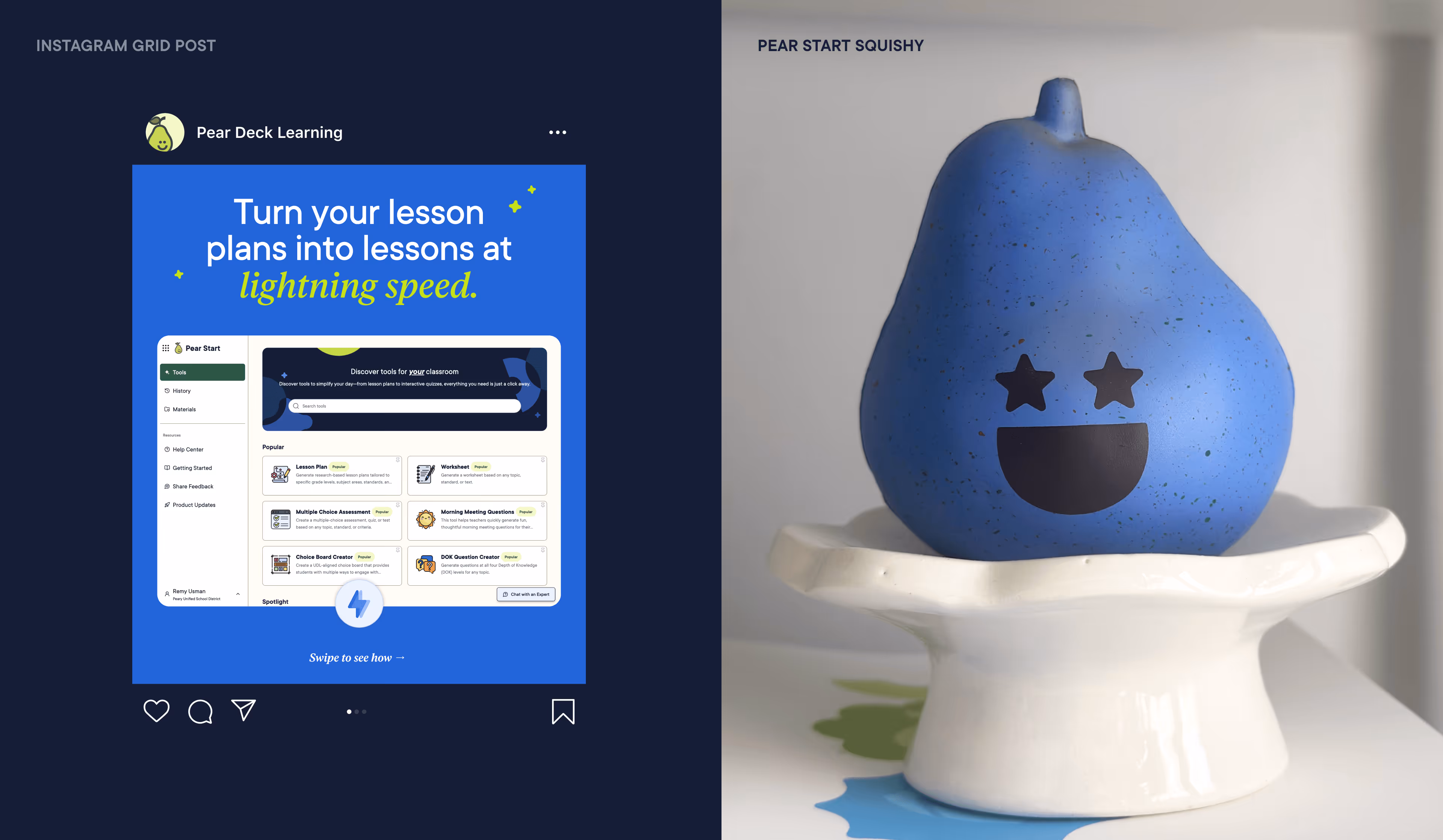
As Pear Deck Learning’s first AI-driven product, Pear Start launched with a new sub-brand designed to stand on its own while staying rooted in the parent brand. To strike that balance, we expanded the palette with cornflower blue, a bright and optimistic hue built to play off the signature kiwi while signaling innovation and speed. Applied across web, social, and digital touchpoints, these elements form a distinct visual system that makes Pear Start immediately recognizable within the broader brand.
Client
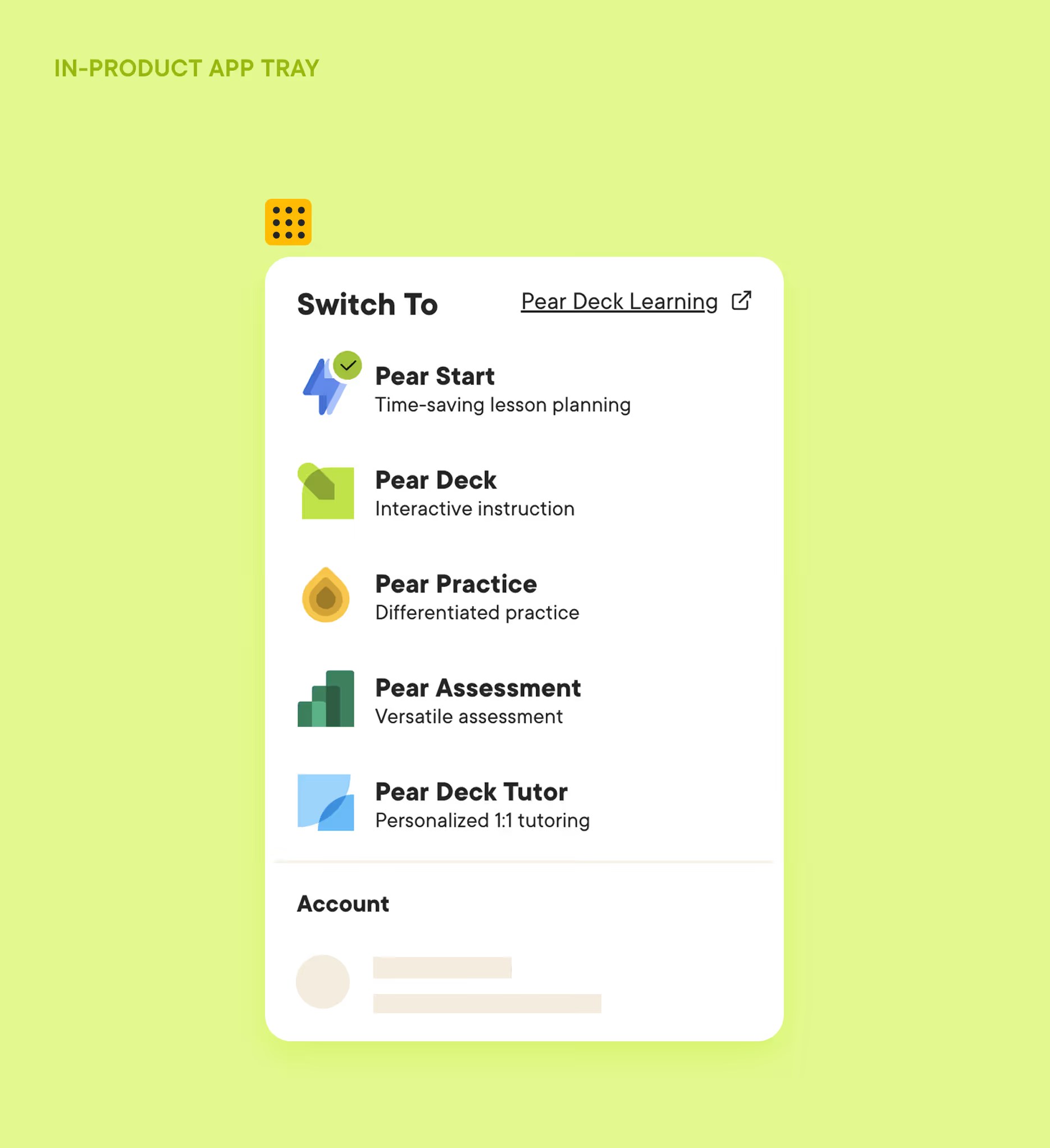
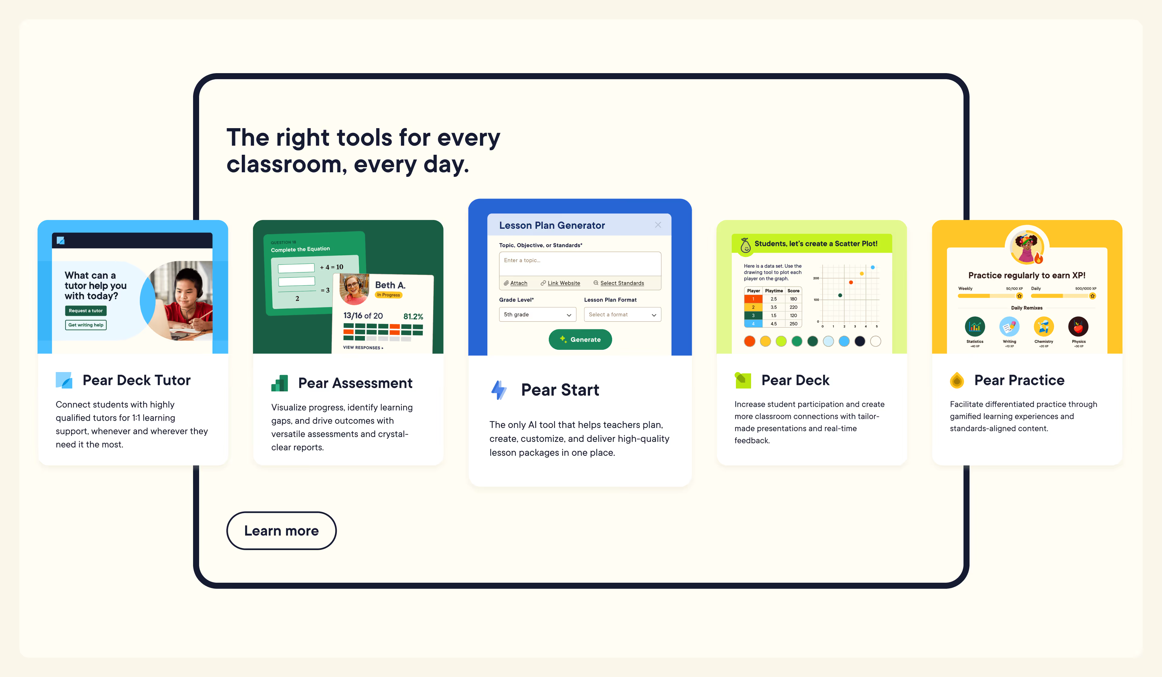
Pear Deck Learning
Role
Art Director, Lead Designer
Team
Amy Ahrens, Creative Director
7,000+
teacher sign-ups attained pre-launch through Pear Start product landing page.
“This is a quote about how successful this project was.”
— Anonymous Attribution
Section title
Lorem ipsum dolor sit amet, consectetur adipiscing elit. Ut eleifend ultricies tellus eget dictum. Suspendisse sem eros, porta et fringilla quis, volutpat nec sapien. Mauris tincidunt odio sit amet orci pulvinar, vel consectetur felis vestibulum.