Refreshing the GoGuardian brand
Brand Refresh / Web Design
Founded in 2014, GoGuardian empowers schools and districts with EdTech solutions that enhance online safety and foster student engagement. In 2024, the GoGuardian creative team led a brand refresh and website redesign to evolve the company’s visual identity. The result is a warm, approachable system that champions educators while standing apart in a sea of tech blues.
Client
GoGuardian
Role
Art Director, Designer
Team
James King, Creative Director
Katie Krull, Art Director & Sr. Designer
16%
WoW lift in homepage lead conversions.
5%
increase in product page conversions at scale.
Evolving the brand system
As GoGuardian’s approach to EdTech matured, so did the need for a visual identity that could grow with it. The updated system replaced Inter with Grenette for display and TT Commons for body copy, enhancing readability and personality while aligning type hierarchy with Pear Deck Learning for subtle consistency across the portfolio.

A refreshed palette brightened the core navy and introduced warm khakis, sunny yellows, and calming lilacs — a distinctive and welcoming alternative to the industry’s standard tech blue. Together, these updates brought energy and personality back into the brand while creating visual cohesion across the entire GoGuardian ecosystem.
Building a flexible visual system
The refreshed identity channels the strongest elements of the existing brand and expands them into a warmer, more flexible system. New illustration styles, product personas, and component libraries give GoGuardian a consistent visual language that works across every touchpoint, from large-scale events to everyday communications.

Every detail reinforces the same idea: approachable, educator-first design that reflects GoGuardian’s belief in learning as an active, human experience.
Website redesign
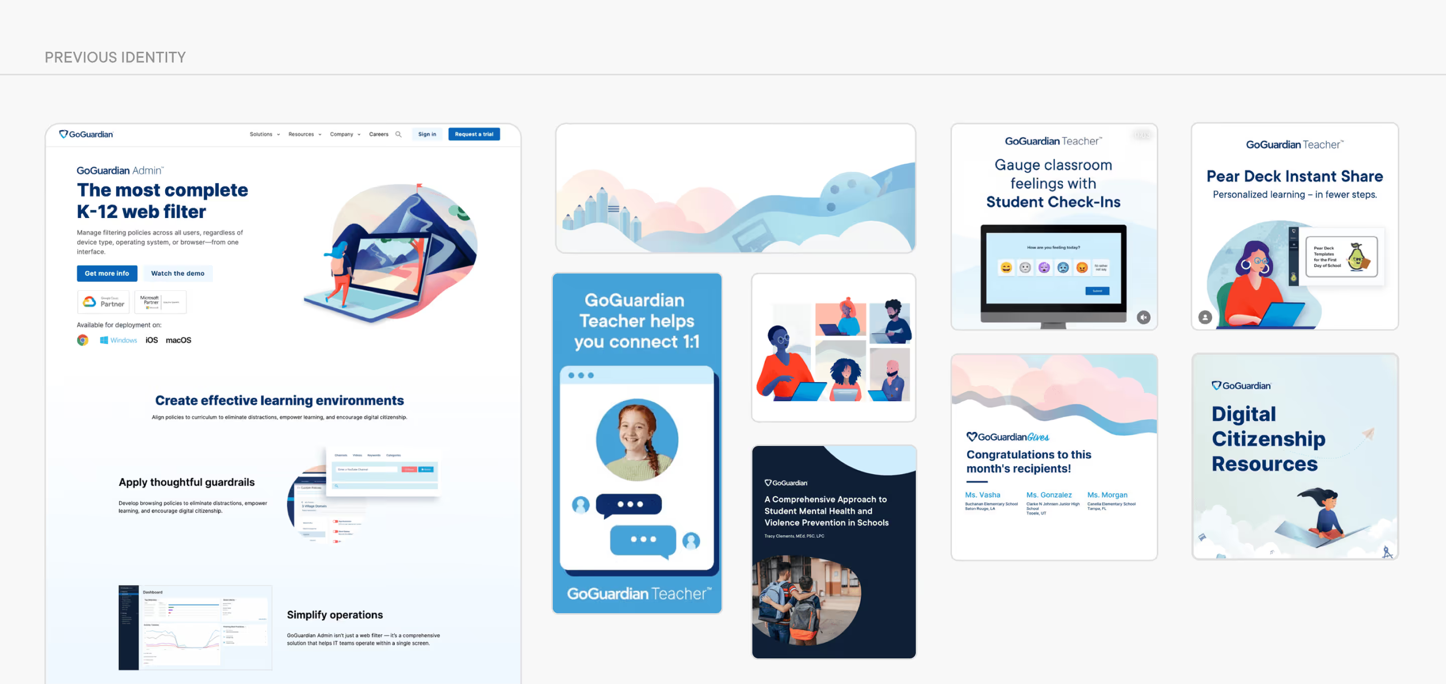
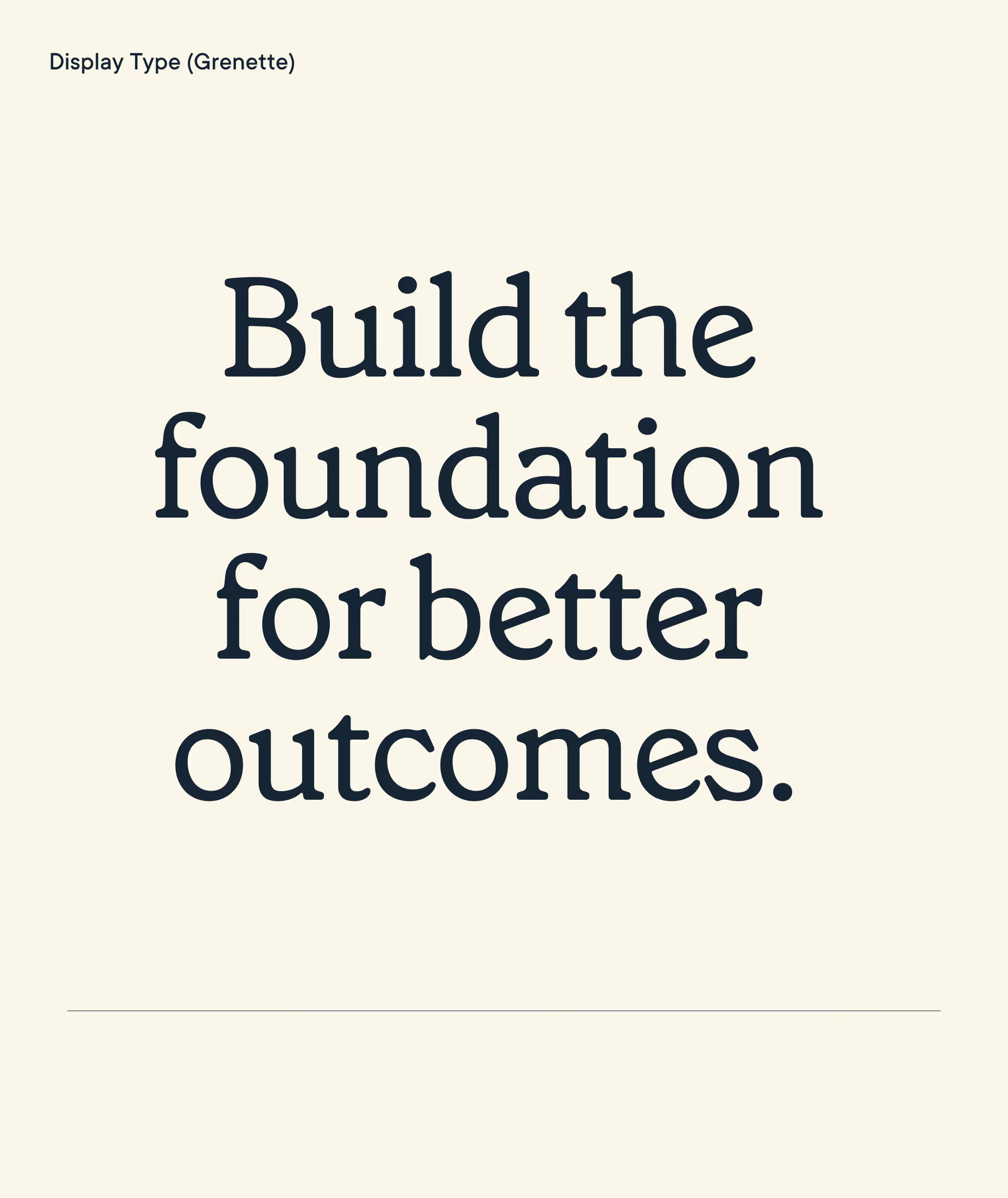
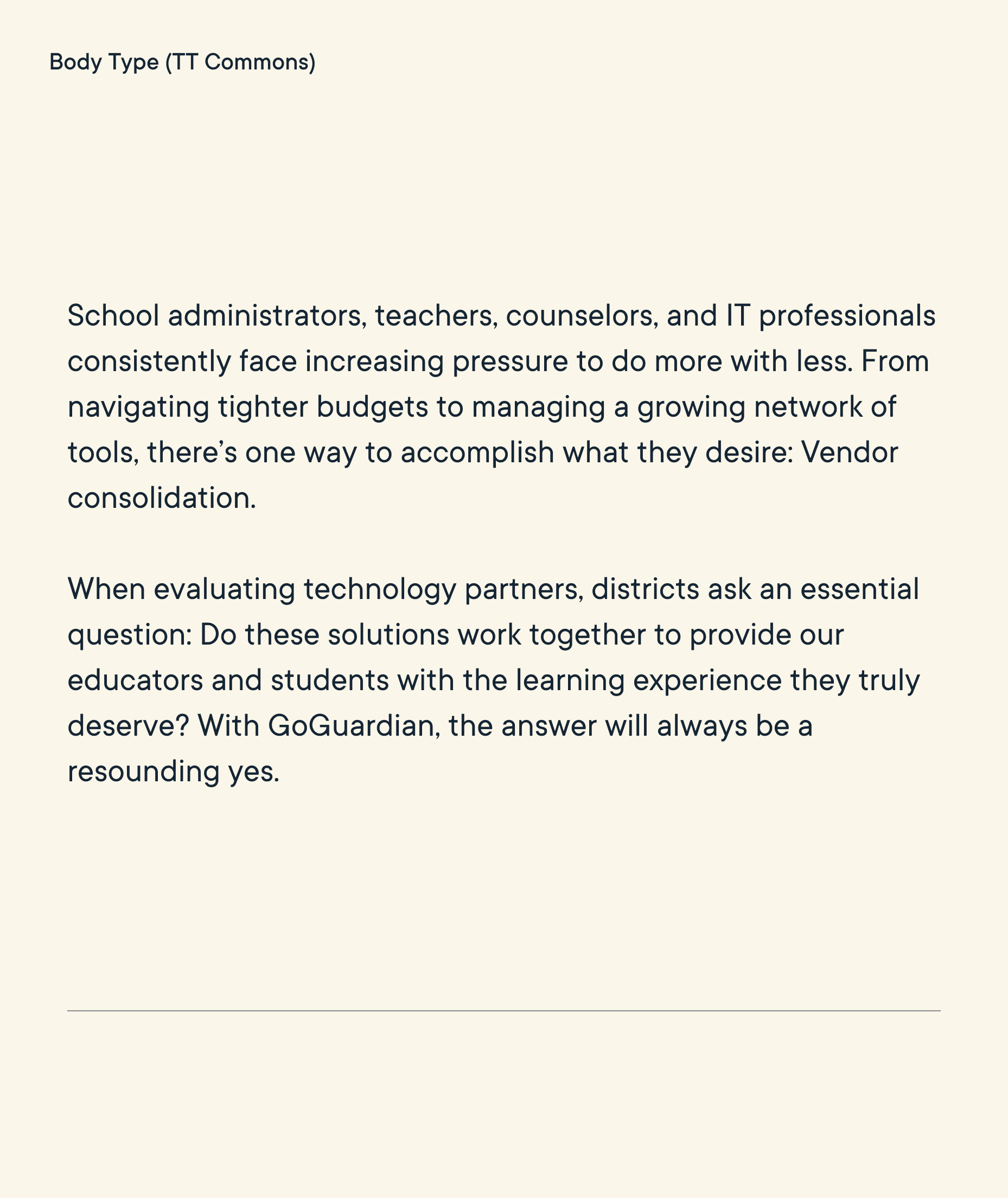
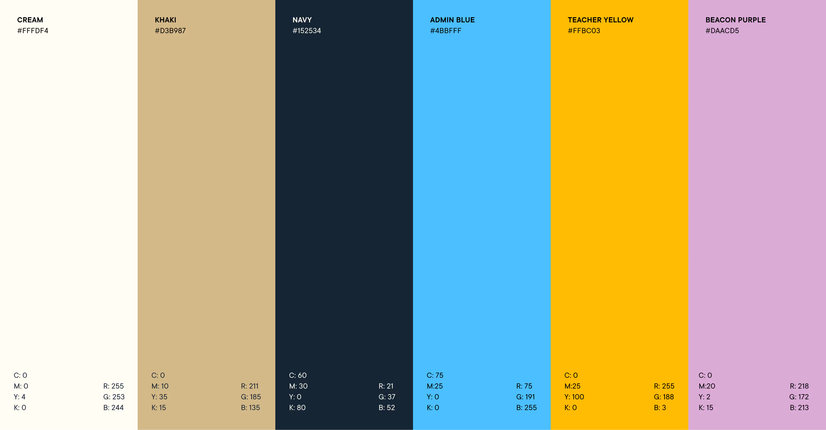
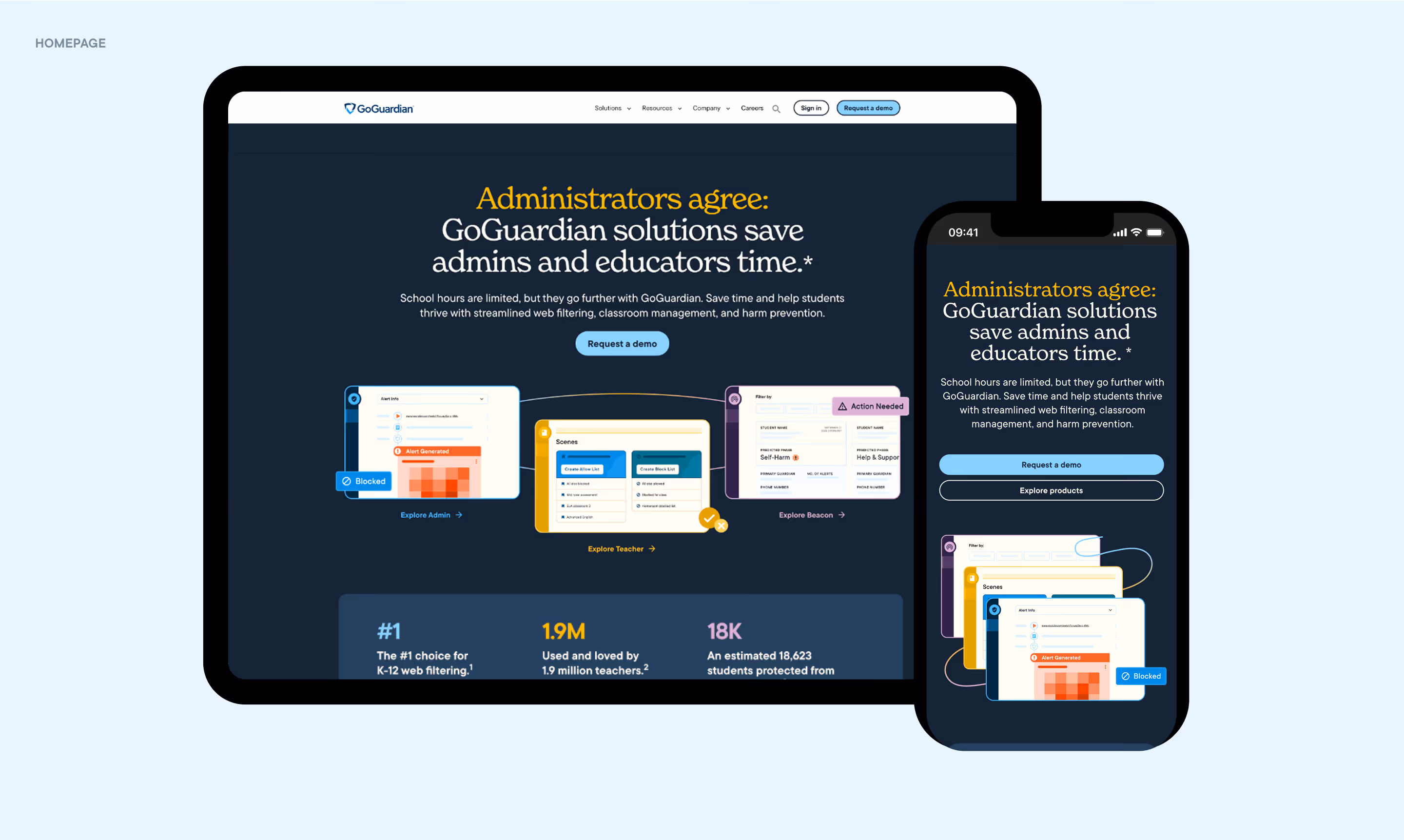
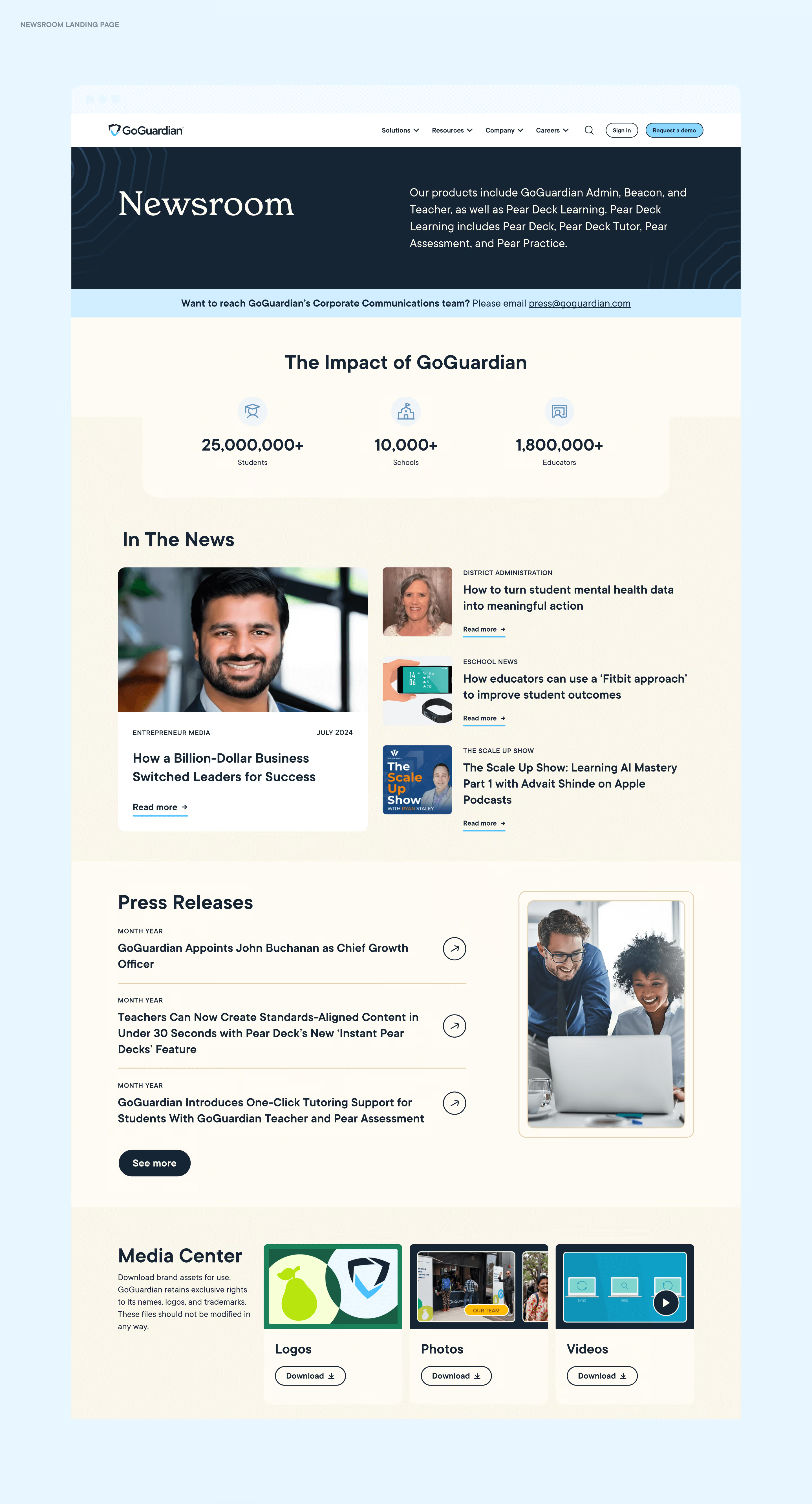
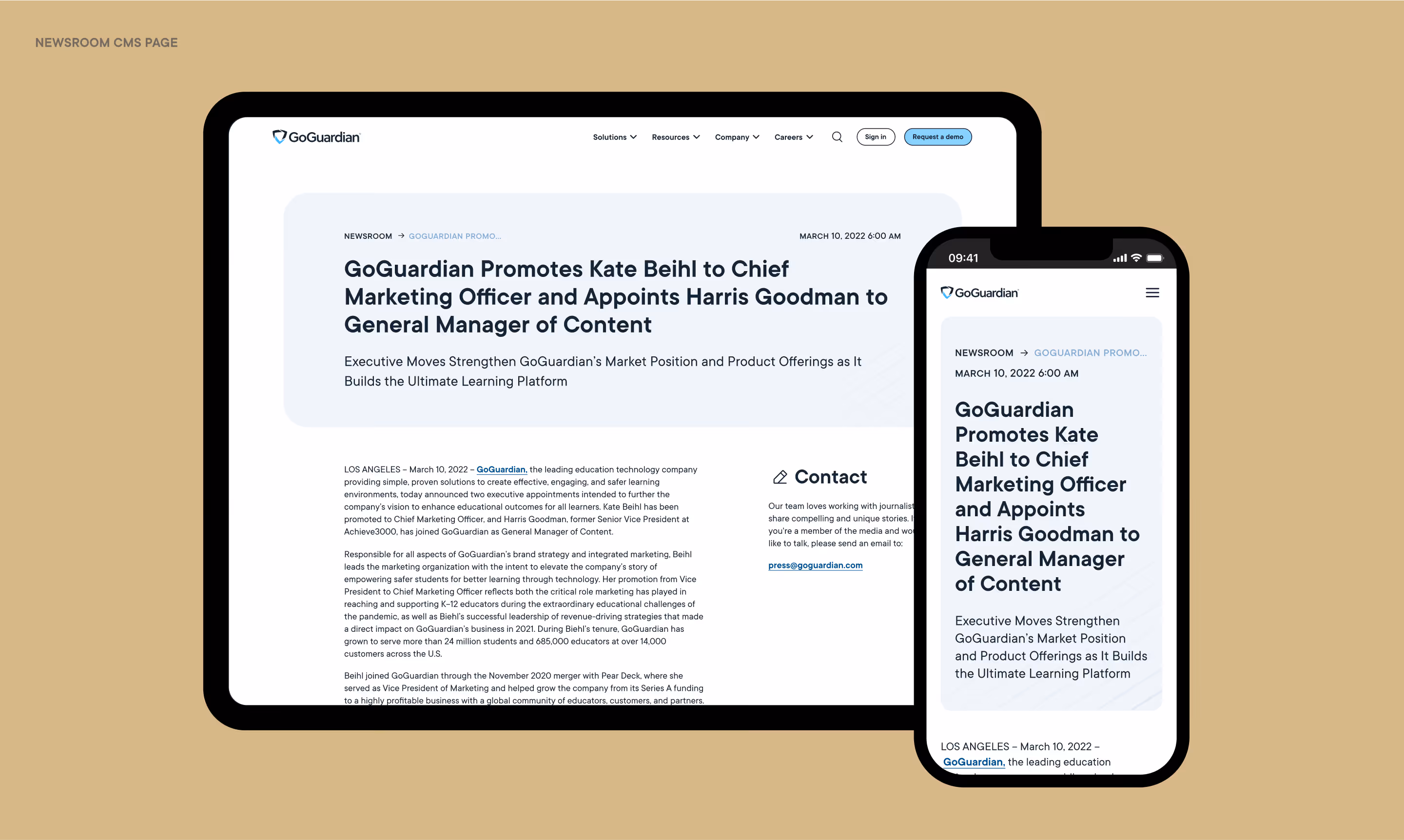
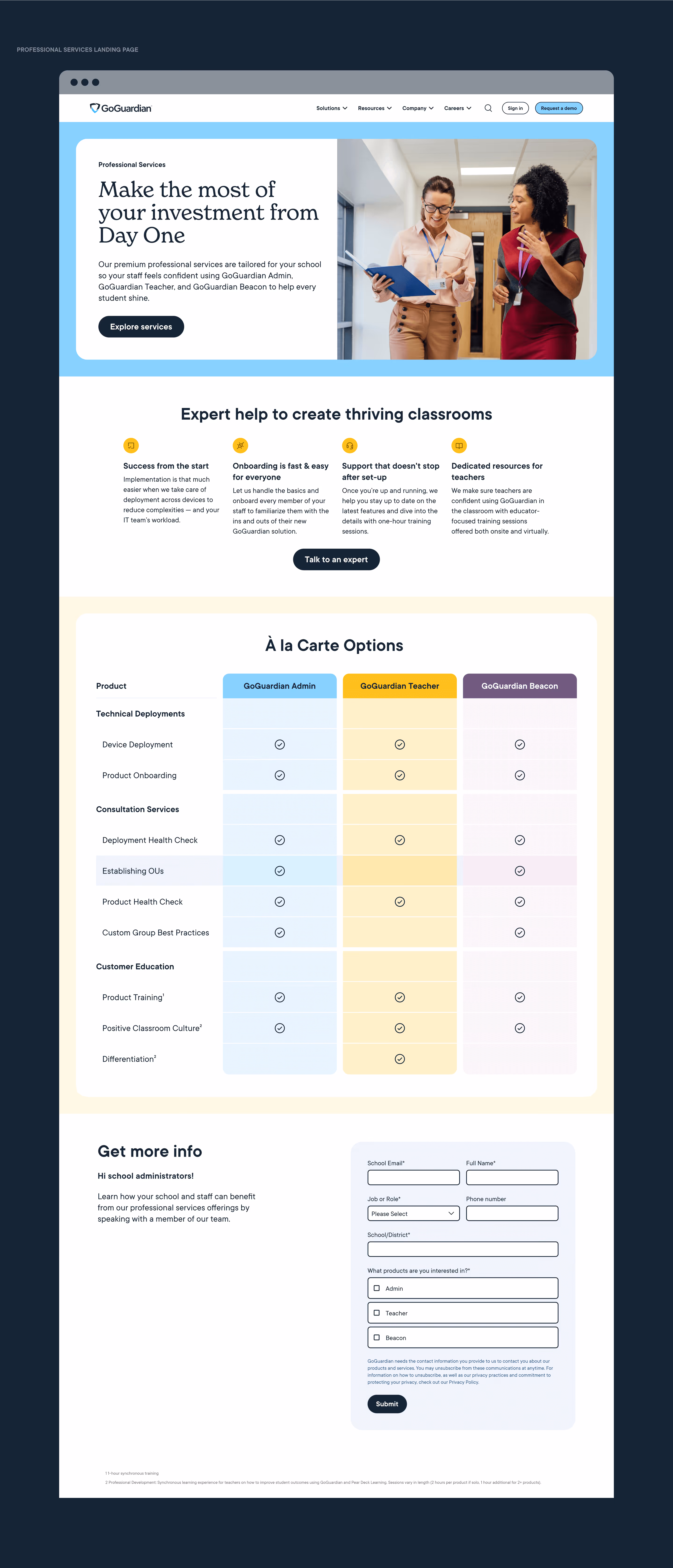
I led the website redesign for this refresh, developing a design system for UI components such as buttons, links, typography, and featured content. For pages outside my direct design scope, I provided art direction, crafting medium-fidelity layouts and defining new components to improve usability.

My focus was on enhancing user experience through simplified interactions, responsive layouts, and intuitive navigation — ensuring the digital expression of the brand felt as welcoming and thoughtful as the identity itself.
Built for growth
This identity was designed to scale and adapt to new products, campaigns, and partnerships.

From the smallest UI component to the largest tradeshow presence, every element reinforces GoGuardian’s position as a trusted, connected, and future-ready leader in education technology.