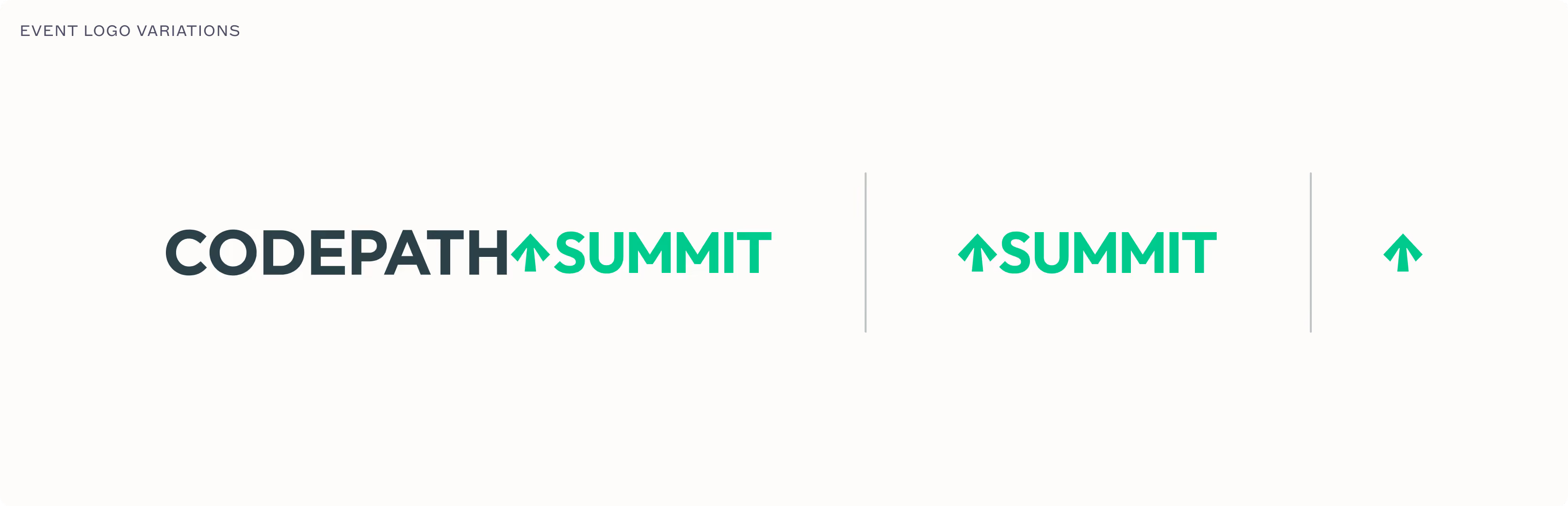
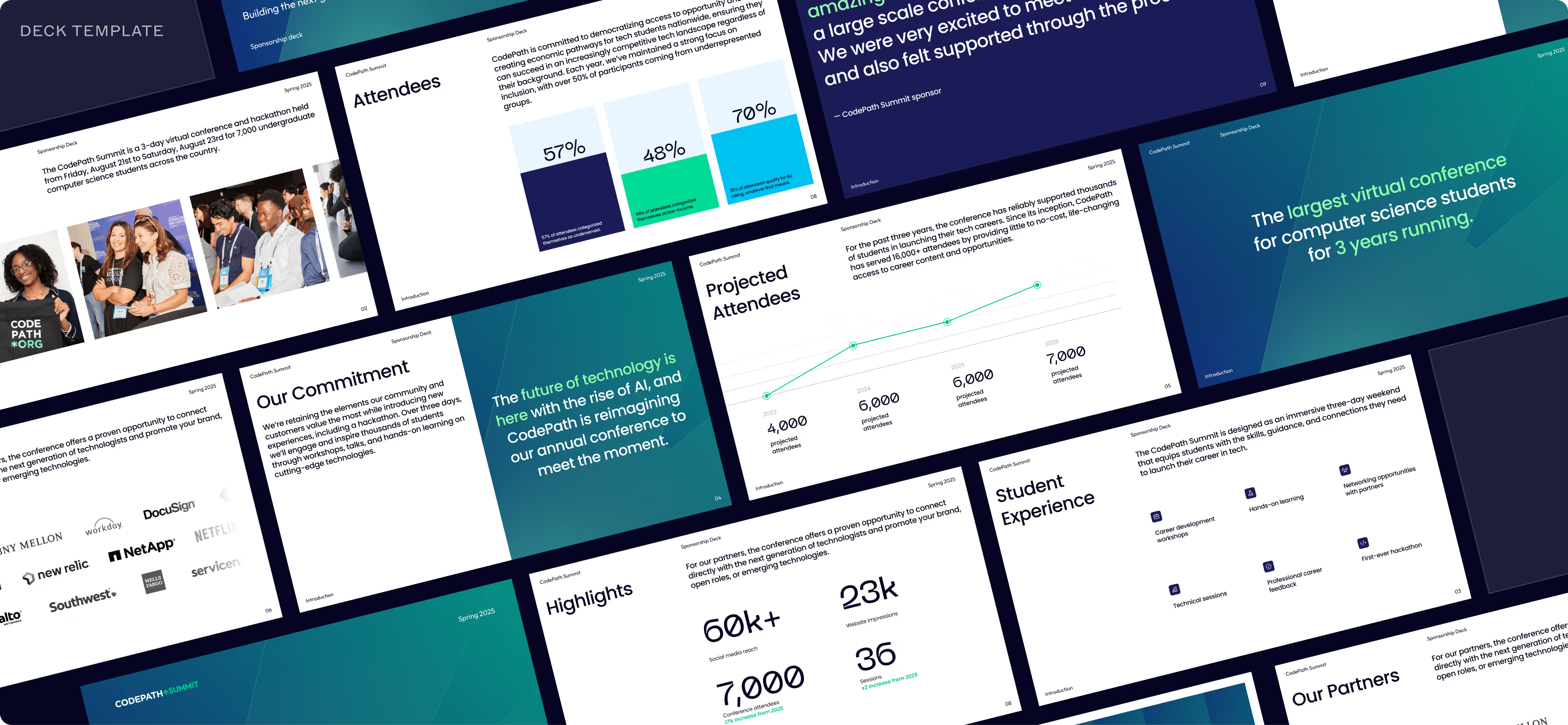
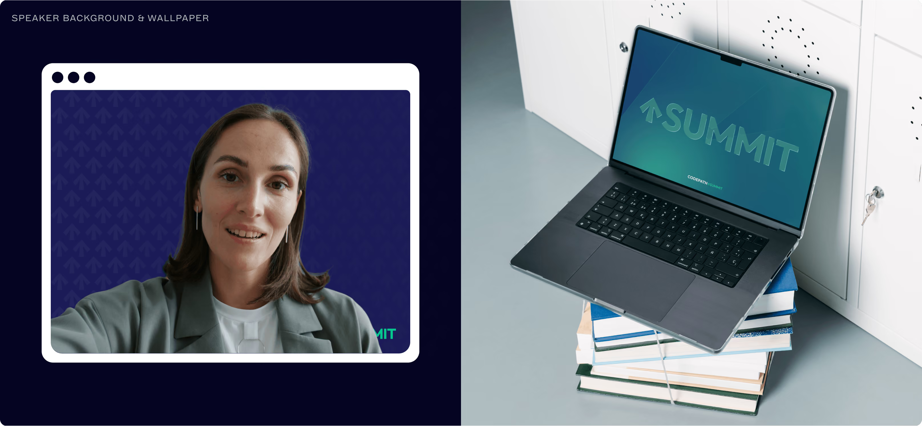
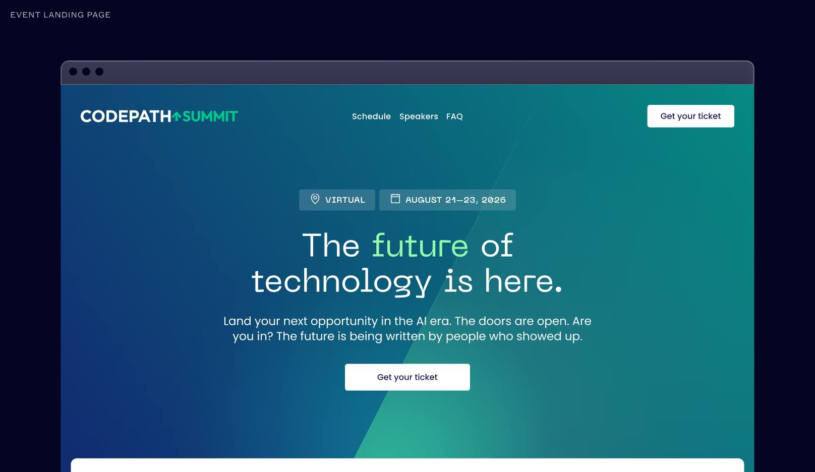
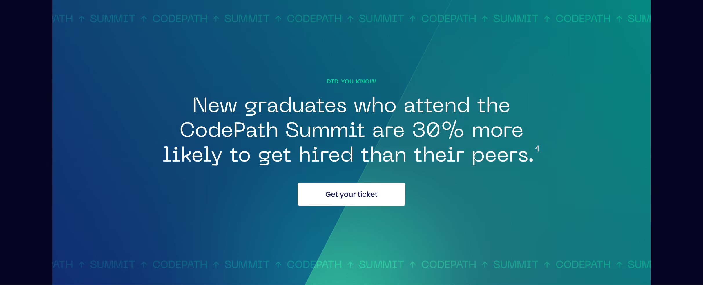
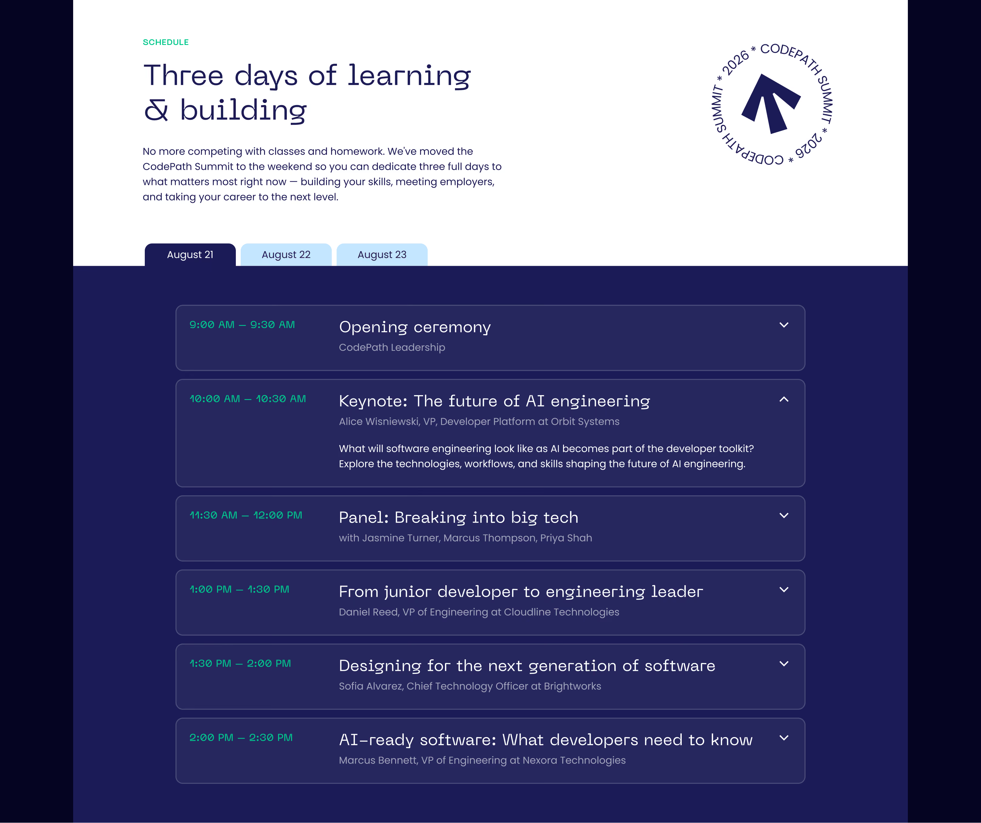
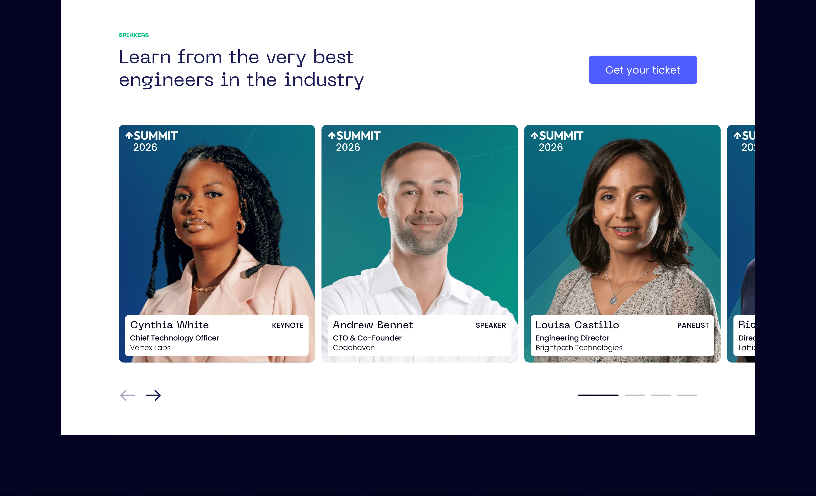
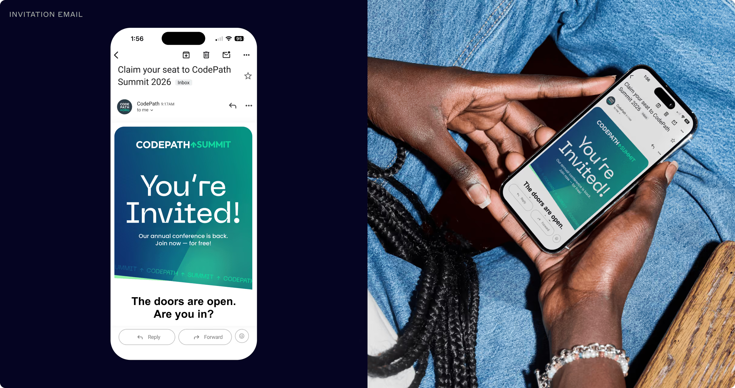
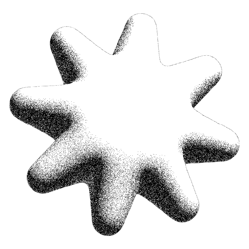
CodePath Summit needed to feel like a distinct event identity within the brand ecosystem while maintaining a clear connection to its parent brand.Drawing inspiration from the asterisk in CodePath’s primary logo, I developed an arrow-shaped mark that signals movement, progress, and forward momentum.
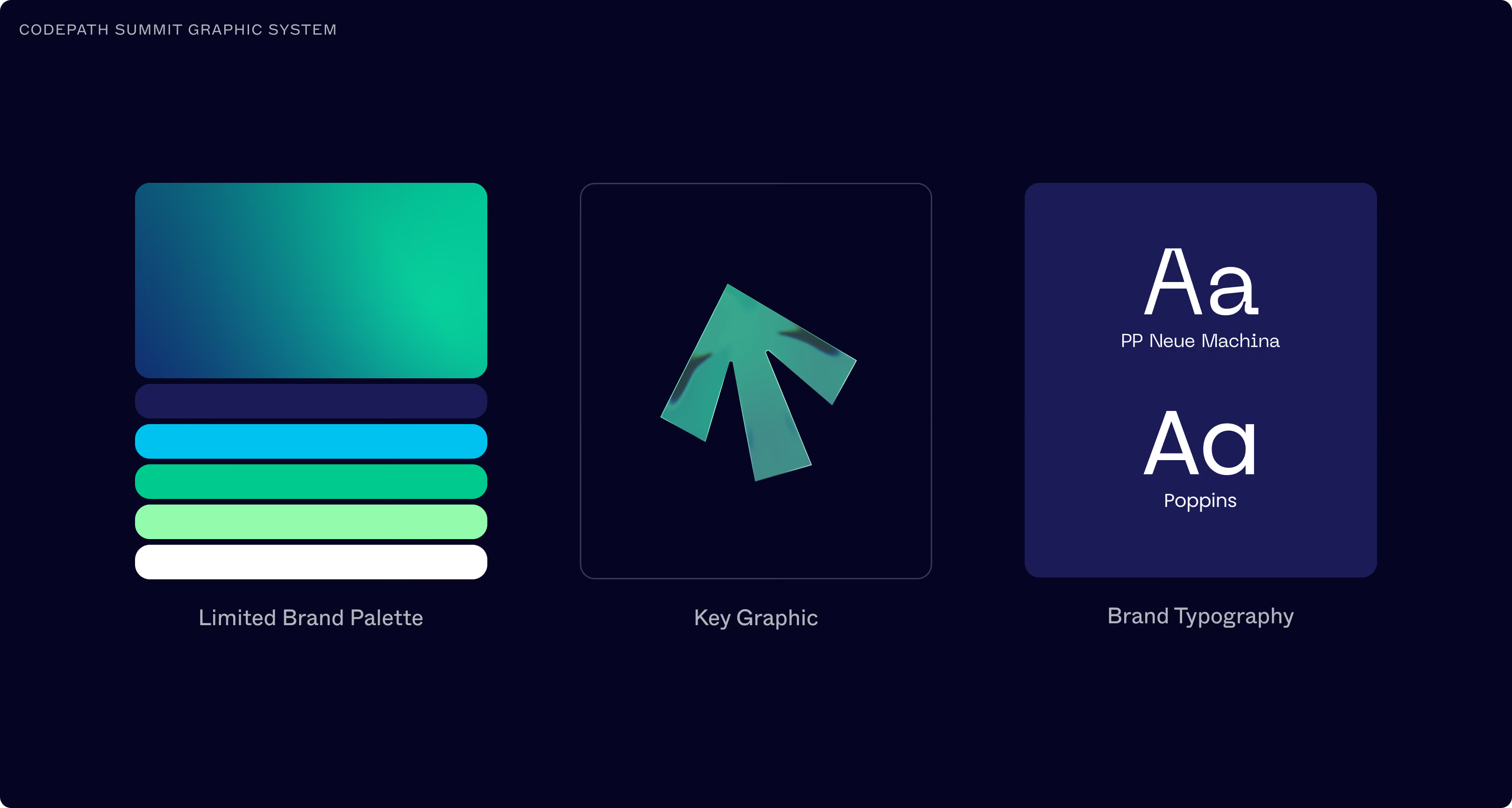
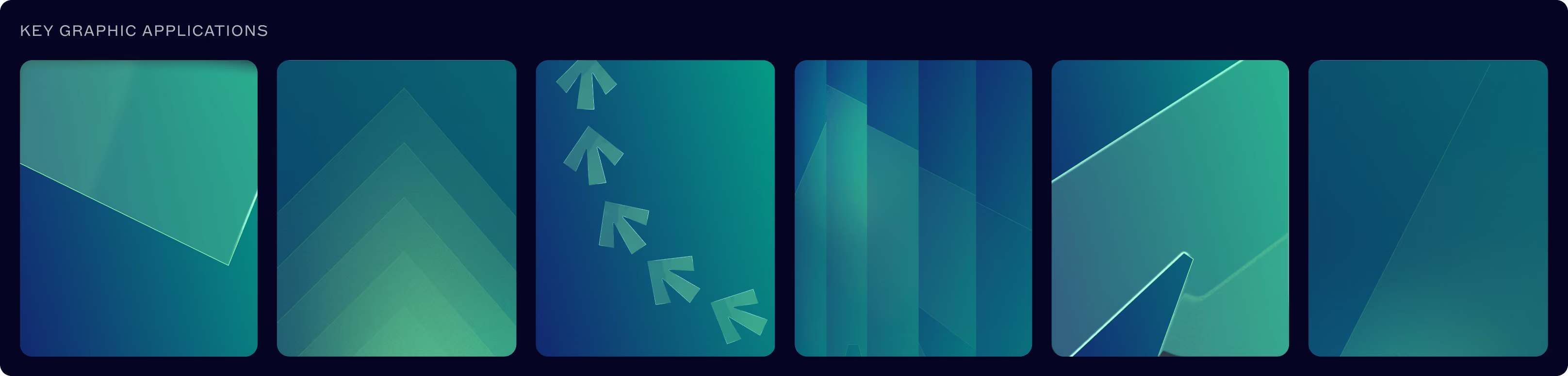
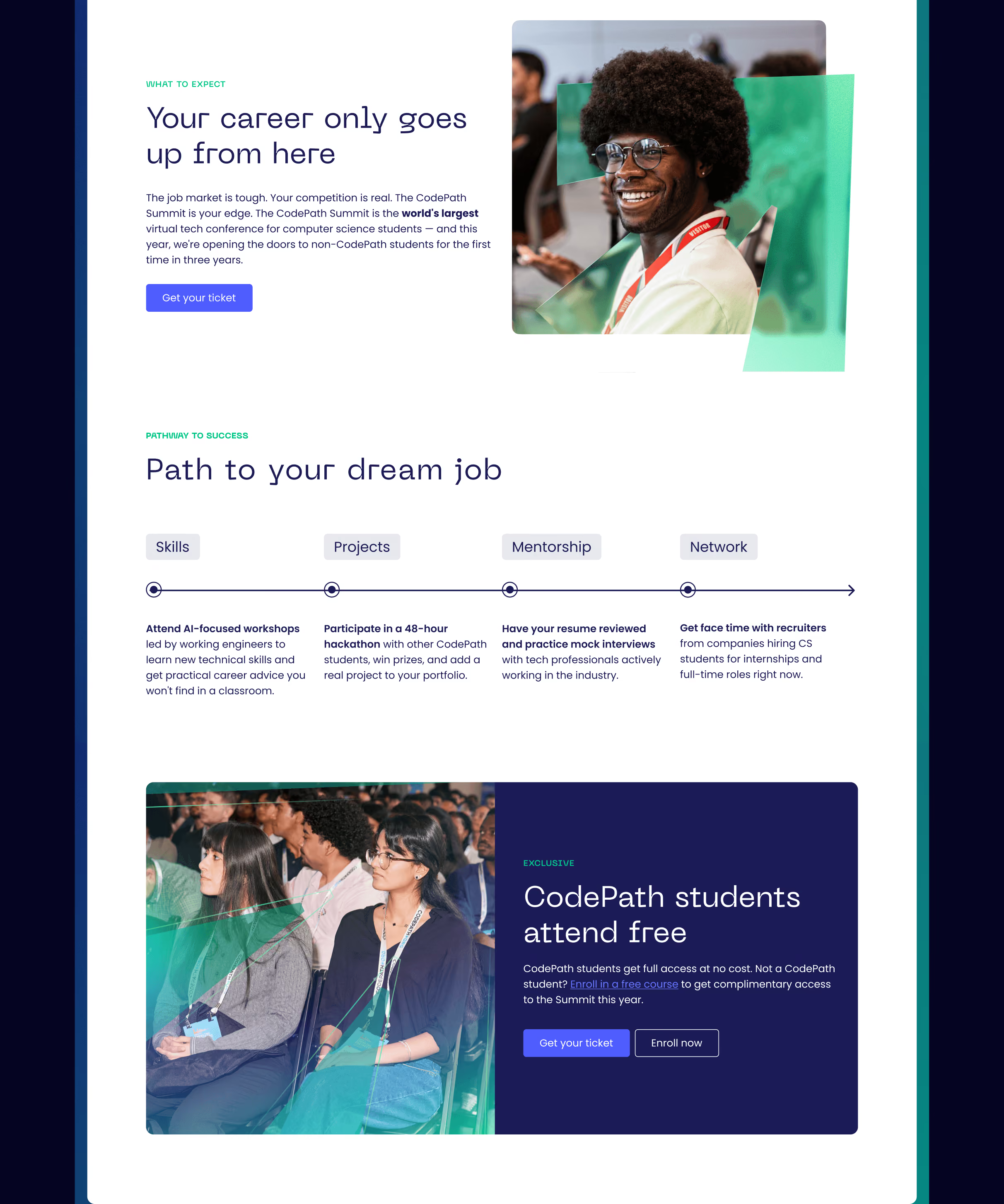
The visual system builds on CodePath’s established brand colors, using a gradient to carry through the parent brand’s existing visual language. Glassmorphism adds a contemporary, dimensional texture to select elements, extending a visual treatment used across recent applications. Together, these elements create a polished, contemporary aesthetic that feels distinctly Summit while remaining rooted in CodePath.